Hand2Heart
A UX Case Study

The Product
Hand2Heart is a national healthcare organization focused on educating users about the importance of early CPR. The organization needs a tool that helps people learn how to give CPR. Hand2Heart targets users with a strong desire to help their community while allowing them flexibility to get certified from their home.
The Problem
Community members and healthcare workers want a way to complete CPR certification/recertification in a timely and efficient manner.
The Goal
Design an app and corresponding website that allows users to complete learning modules and take an exam to obtain CPR certification/recertification from any location including their homes.
-

ROLE
UX Designer
-

TOOLS
Figma
-

DURATION
July 2023 - August 2023
-

DUTIES
Conduct interviews, user research, paper and digital wireframing, low- and high-fidelity prototyping, conducting usability studies, accounting for accessibility, and iterating on designs
User Research
I conducted interviews and created empathy maps to understand the users I am designing for and their needs. One user group identified during my research were people who are small business owners and who want their customers to feel comfort that they are in good hands if a medical emergency were to come up.
Research identified specific barriers for the user including obtaining online certification, scheduling live courses to correspond with self-paced learning, and synced progress from the app to the website for on-the-go users.
Persona 1: Renée
Problem statement:
Renée is a self-employed dance instructor who needs to learn CPR & AED use because she wants her customers to feel comfortable working out in her studio if there is a medical emergency.
Persona 2: Howard
Problem statement:
Howard is a very busy pediatric surgeon who needs to renew his BLS certification because he is required to re-certify every 2 years to maintain his license.
Starting the Design
Digital Wireframes
Digital wireframing allowed me to more closely view and address user pain points and optimize the experience.
I focused a great deal on simplifying the homepage of the application to allow the user to quickly tap into their desired learning activity
Features:
Quick buttons to bring the user immediately to their desired course
Search feature if the user is in need of a course that is not one of the top 4 offered by Hand2Heart
Usability Testing & Low-Fidelity Prototype
To prepare for usability testing, I created a low-fidelity prototype that connected the user flow of taking and passing a CPR course.
Usability Study Parameters
-
STUDY TYPE
Unmoderated usability study
-
PARTICIPANTS
7 Participants
-
LOCATION
United States, remote
-
LENGTH
30-60 minutes
Usability Study Findings
-
People wanted an easy way to save their progress in the exam portion in case they were interrupted and needed to exit.
-
Within the app, people wanted a way to see their schedules indicating they were booked for a live class.
-
People preferred a clear menu which locked sections of the course which were not yet completed.
Mockups
Based on the insights from usability studies, I applied design changes like inactivating questions to prompt the user to answer questions in the appropriate order.
Before usability study
Additional design changes included inactivating sections of the course which had not yet been completed so the user could easily locate their progress within the course.
After usability study
Before usability study
After usability study
High Fidelity Prototype
The high-fidelity prototype followed the same user flow as the low-fidelity prototype, including design changes made after the first usability study.
Accessibility Considerations
CTA on the home screen defines the primary task or action for the user
Use of labels with icons allow for elements to be read by a screen reader
Sitemap
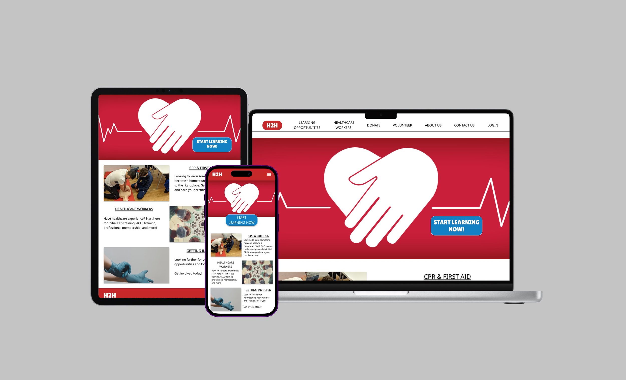
After completing the design of the app, I began working on the responsive website. I used the Hand2Heart sitemap to guide my designs and ensure I formulated a cohesive experience across devices.
Responsive Designs
Key Takeaways
Impact
There are few ways to cut corners when it comes to medicine, but making the information more easily accessible and universal allowed users to see the impact they could make.
What I learned
Going through the design process allowed me to consider solutions that seemed to fit needs for a small number of users. In turn, this offered a solution to problems experienced by a larger majority of users.
“The Hand2Heart app helps small business owners give back to the community by letting us feel more comfortable dealing with a medical emergency while waiting for help to arrive.”
Next Steps
1
Conduct another round of usability testing to determine how many users are able to successfully obtain certification through the online platform.
2
Include more professional development opportunities for those working in healthcare.
3
Provide opportunities for businesses/groups of people to collaborate on courses and earn certificates together.


